Before & after: how a well-designed landing page can double your leads
What really changes when you optimize your landing page for conversion and how that before/after looks in practice.
Part of our Web Design & Development expertise
Learn more →Most companies don’t have a traffic problem.
They have a landing page problem.
They invest in ads, content and campaigns, but once people land on the page… they get lost, confused, or simply leave.
At The Agenzzy we’ve seen this over and over again: a well-designed landing can easily double the number of leads with the exact same traffic.
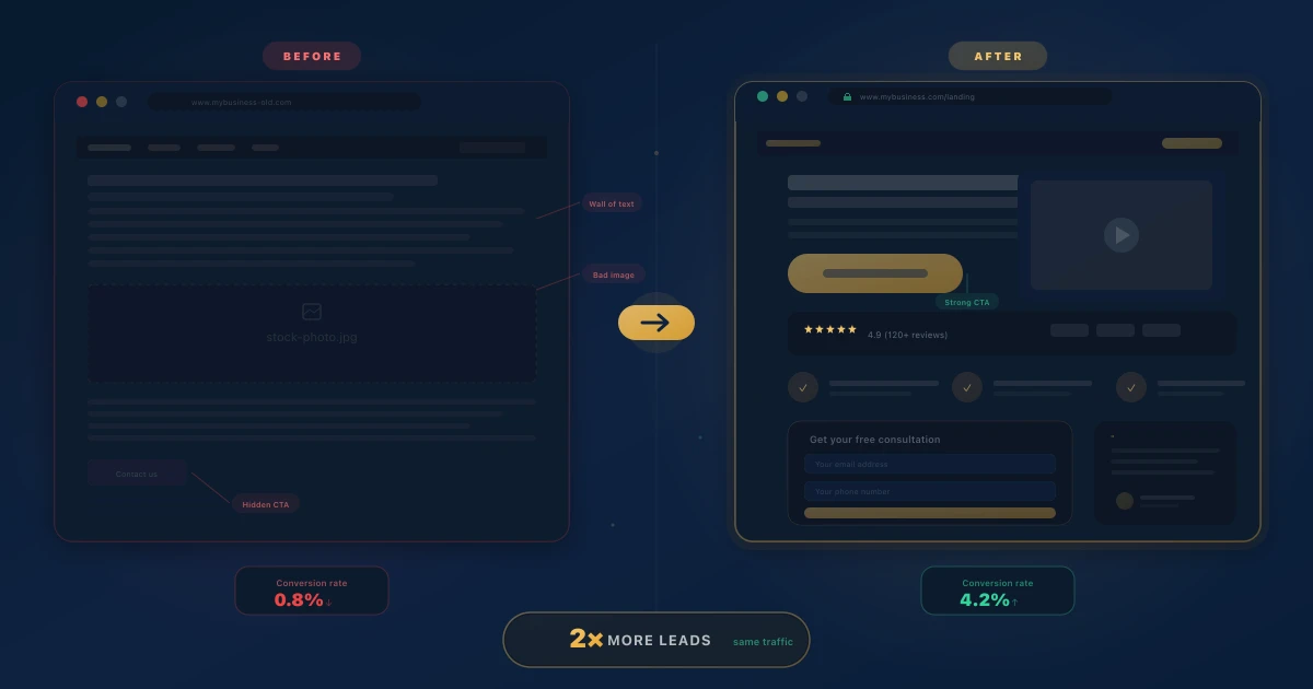
Let’s look at that before & after.
The “before”: a typical landing that doesn’t convert
Picture a very common B2B service landing:
- Generic hero: “Innovative solutions for your business”.
- Lots of text, poor visual hierarchy.
- It's unclear what problem you solve or who it's for.
- One lonely button at the bottom: "Contact us".
These are textbook examples of the website mistakes that silently cost you clients.
Result:
- People coming from ads don’t know if they’re in the right place.
- Users scroll for three seconds and bounce.
- The few leads that come in are not ideal, because the message is too broad.
The “after”: a landing built for clarity and action
Same company, new landing optimized for conversion.
1. Hero that answers 3 questions in 5 seconds
Instead of something vague, it now reads:
Upgrade your design team without hiring in-house.
Creative subscriptions for brands that need constant, on-brand design.
In a single block it’s clear:
- What you do
- Who it’s for
- What outcome it drives
2. A very concrete value proposition
Right below the hero, instead of dense paragraphs, we show three core benefits:
- ✅ More speed: assets ready in 48–72 hours.
- ✅ More consistency: one team that understands your brand.
- ✅ Less management: no hiring, onboarding or HR overhead.
This helps users quickly say: “this is exactly for me” or “nope, not my case” (which is also good).
3. Social proof that actually gets seen
The new landing includes:
- Logos from relevant clients.
- 1–2 short, concrete testimonials.
- A mini case: “+37% booked demos after redesigning the landing”.
Social proof stops being a block nobody reaches and becomes part of the main argument.
4. Clear structure, no distractions
In the “after”:
- There’s no busy navigation with ten links pulling users away.
- Every section answers a logical question:
- What is this?
- Who is it for?
- How does it work?
- What results have others seen?
- What’s the next step?
Fewer options, more focus.
5. Consistent, action-driven CTAs
Instead of a generic “Contact us”, the main CTA is:
Book a 15-minute call
And it’s repeated in all the right places:
- Hero
- Benefits section
- Social proof
- Page footer
The user never has to wonder: “What am I supposed to do next?”
What changes in the numbers?
When you treat a landing page as a system (message + structure + design), three things usually happen:
- Conversion rate goes up (more leads with the same traffic).
- Lead quality improves, because the message is more specific.
- Sales conversations are smoother, since prospects arrive better informed.
It's not magic. It's clarity + smart design. If you want to quantify the financial impact, our ROI breakdown for professional web design puts real numbers behind these improvements.
How we design landing pages at The Agenzzy
Our typical process:
- Diagnosis – review the current landing and data (if available).
- Story & structure – define content flow and key messages.
- Wireframe – arrange sections with conversion in mind.
- Visual design – apply or refine your visual brand system.
- Ready-to-build handoff (or we handle development, depending on the engagement).
Is your landing closer to the “before” than the “after”?
If you’re sending paid traffic to a page that doesn’t tell your story well, you’re paying twice: for the click and for the missed opportunity.
👉 Book a call and let’s review your current landing together.
In 20 minutes you can walk away with a clear plan to move it to the “after” side.


